Linear Regression
A scatter plot is a graph that represents a relationship between two variables in a dataset by plotting all the points onto the graph. If the relationship is from a linear model, or a model that is nearly linear, then we can use our knowledge of linear functions to draw conclusions.
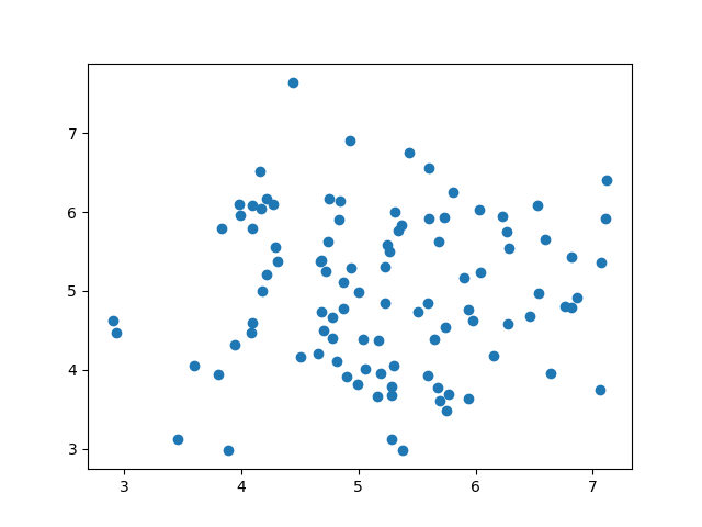
Not all scatter plots indicate a linear relationship.
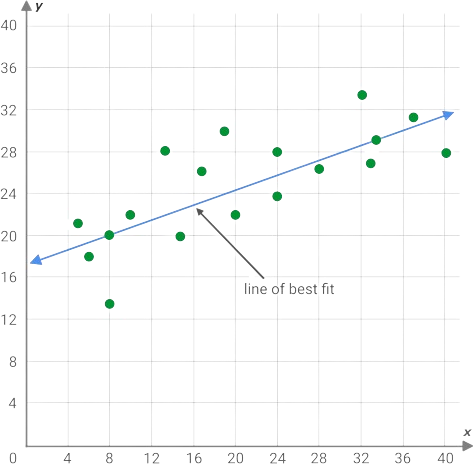
Line of Best Fit
The line of best fit is a linear function that best fits our data. This is a linear function we can then use to make predictions about the data. We can always "eyeball" a line that seems to fit or we can use the formula for least squares regression to obtain a line of best fit.
Given a set of points where is the set of inputs, is the set of outputs, and is the number of points, we can calculate the slope using...
Using the slope, which is the value of , we can calculate the -intercept using...
Finally, using the values of and we have acquired, we can create the line of best fit using .
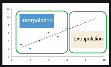
Interpolation vs Extrapolation
Now that we have a linear function we can use to make predictions, we need to understand its limitations. When we predict a value using a function, we use two processes. The process known as interpolation is when we predict a value inside the domain and range of the data. On the other hand, the process known as extrapolation is used when we predict a value outside the domain and range of the data. This distinction is important when making predictions because of model breakdown which is a certain point where our model no longer works. Outside the domain and range of the data, we do not know how the data will change and we need to be aware of that fact. At the end of the day, we are just making predictions.
Correlation Coefficient
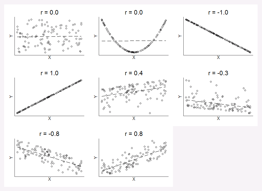
Not all lines of best fit are created equal. Some data exhibit stronger linear trends than others and so their linear models are more accurate because the data is less scattered. We need a way to quantify how strong the linear trends are and we can measure this using the correlation coefficient.
The correlation coefficient is a value, , between and which suggests the strength and direction of a linear relationship. If , then we have a positive (increasing) relationship and if , then we have a negative (decreasing) relationship. Also note, if is closer to then the data is more scattered and if is closer to or then the data is less scattered. The less scattered the data is, the stronger the linear relationship is.
Given a set of points, where and are the data points, is the mean of the set of , and is the mean of the set of , we can calculate the correlation coefficient using...